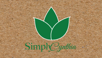
The design solution was to take her ingredients that she uses in her products as inspiration for both the name as well as the logo. For the name, Simply Cynthia. Simply Cynthia resembles the sim- plicity of the elements and ingredients that are used in her soaps and bodywashes and her name is Cynthia. For the logo, many different leaves were selected but in the end three simple leaves were chosen. This goes back to the natural aspect of her products. The typography includes the words simple in the Mao font. The C in Cynthia is taken out and made bigger and crosses over the y in simply. The C is a font called Alex’s Brush and the rest of Cynthia is Great Vibes. The packaging includes the logo as well as a body wash which is a font called Shree Devanagari 714. For the chap- stick, the logo was scaled down with the flavor of the chapstick as well as little information about where the product was made.
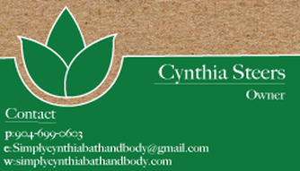
Logo & Business Card

|
|